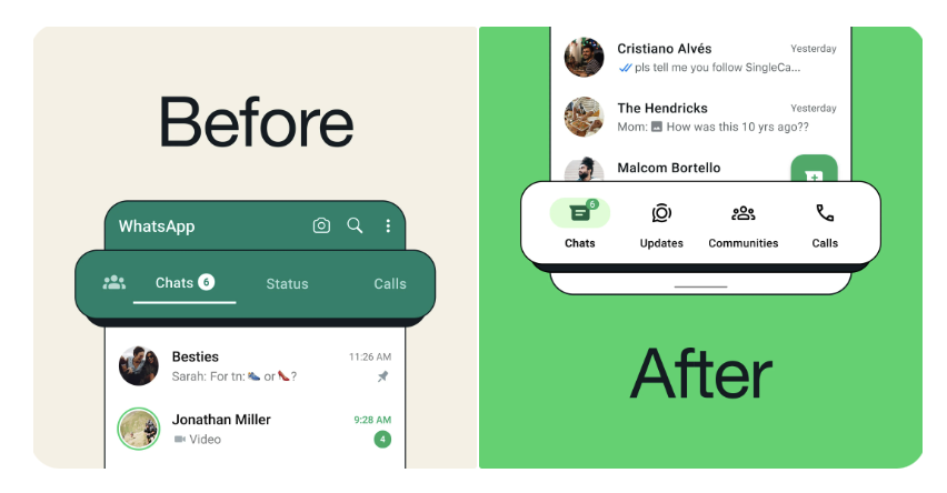
Meta has finally introduced a significant change to the WhatsApp interface for Android users, introducing a new menu bar that aims to standardize the user experience with that of the iOS version of the application. After nearly a year of testing in beta, this update was warmly received by the Android community, who wanted more intuitive and accessible navigation.
WhatsApp Android is catching up with iOS when it comes to navigation
The announcement of the update was made via the official WhatsApp account on Twitter (X), as reported by Android Police. The new navigation menu layout, now located at the bottom of the screen, is designed to be more accessible and visually appealing, bringing important features closer to the reach of the user’s thumbs.
News in navigation
One of the most noticeable changes is the introduction of a new Community tab, which replaces the icon previously positioned on the left of the menu bar. This change not only gives the app a stronger social dimension, but also makes it easier to move between different sections with a simple swipe.
Update for an improved experience
Android users are encouraged to update their app via the Google Play Store to immediately access these new features. The update promises a new user experience with simplified navigation that makes using WhatsApp even smoother and more enjoyable.
Continuous improvements and testing
In addition to the menu overhaul, WhatsApp continued its commitment to continuous improvement of the app and conducted tests on various features such as the default quality of photos and videos and the introduction of fast forwarding and rewinding tools based on needs and wants.


